Miro
Best for: Workshop facilitation and cross-team alignment
Miro is a digital whiteboard. It's fast, visual, and most teams already have it. For getting a room, or a remote call, to agree on what the customer journey looks like in theory, it's hard to beat. Templates load in seconds. Sticky notes are infinitely rearrangeable. Everyone can see each other's thinking in one place.
Where it ends: Miro maps are hypotheses. They reflect what your team believes is happening, not what's happening on the ground. There's no live data, no channel integration, no way to check the map against real customer behaviour. It's a starting point. Treat it as one.
UXPressia
Best for: CX teams who need structured, shareable journey maps
UXPressia is purpose-built for journey mapping. You get proper persona profiles, multi-lane maps, impact mapping, and a shared workspace so the whole team is working from the same document. The templates are more structured than a whiteboard tool, which pushes teams toward more rigorous thinking.
It's primarily a documentation platform. The maps are well-organised, but they're still static. They document what someone believes the journey looks like rather than reflecting what's happening in the business today.
Smaply
Best for: Service designers and CX consultants
Smaply sits closer to service design than marketing analytics. It handles journey maps, stakeholder maps, and system maps: useful when you need to show the full ecosystem around a customer experience, not just the customer-facing touchpoints. Consultants and in-house CX teams use it to build comprehensive deliverables for exec audiences.
The depth is its strength and its limitation. For teams who need fast iteration or live data, it's probably more structure than they need. For teams doing serious service design work, it earns its place.
Lucidchart
Best for: Process documentation and technical teams
Lucidchart is a diagramming tool that handles journey maps well because it handles almost everything well. If your team is already using it for process flows and system architecture, it's a reasonable choice for journey work too. Integration with Google Workspace and Microsoft 365 means it fits into existing workflows without friction.
It's general-purpose. Journey mapping is one of dozens of use cases, which means it won't push your thinking further than you push it yourself. Good for documentation. Not built to tell you what the journey means.
cxomni
Best for: Enterprise CX teams who need to manage journeys operationally
cxomni sits above most visualisation tools. It's built for organisations that want to move beyond the static map: managing journeys as living assets, linking touchpoints to business metrics, holding a view across many customer segments at once. Strong G2 ratings reflect real enterprise traction.
The trade-off is complexity. This is a platform that requires investment to implement properly. Teams who want a quick answer to a specific problem will find it overwrought. Teams managing CX at scale will find it worth the setup.
Hotjar
Best for: Digital teams tracking on-site behaviour
Hotjar doesn't produce journey maps. What it does is show you what people do on your website: heatmaps, session recordings, click tracking, scroll depth. That's useful data for the digital part of the journey. Watching a recording of someone struggling to find your pricing page tells you more than a workshop ever could.
The scope is narrow. Hotjar lives inside your website. It doesn't know what happened before someone arrived or what they did after they left. For the full journey picture, it's one piece of a larger puzzle.
Fullstory
Best for: Product and engineering teams debugging digital experience
Fullstory captures every interaction a user has with your digital product. It's powerful for understanding friction in apps and websites: where users rage-click, where they drop off, where the experience breaks. Product teams and engineers use it to identify bugs and UX failures that wouldn't surface in a survey.
Like Hotjar, its lens is digital and bounded by your owned channels. It tells you a lot about the experience once someone is already in your product. It tells you very little about the channel, campaign, or decision that brought them there.
Amplitude
Best for: Product teams tracking feature adoption and conversion funnels
Amplitude is a product analytics platform with strong journey visualisation for digital flows. It excels at showing how users move through a product: which features they adopt, where they convert, where they churn. For SaaS businesses and app-led companies, it's one of the most capable tools available for understanding in-product behaviour.
The journey it maps is the product journey. Marketing, paid media, brand, physical touchpoints, customer service: these live outside Amplitude's view. For teams trying to understand the full customer journey, not just the in-app one, it's a partial answer.
Salesforce Journey Builder
Best for: Teams automating personalised customer comms at scale
Journey Builder is about orchestrating communications, not understanding them. You build automated flows: if a customer does X, send them Y, executed at scale. For CRM-heavy organisations with mature segmentation, it's a serious operational tool.
The insight layer is thin. Journey Builder tells you what messages went out and at what open rates. It doesn't tell you why customers behave the way they do, how a campaign moved a downstream decision, or whether the journey you've built is the one customers want to take through your brand. It's execution infrastructure, not intelligence.
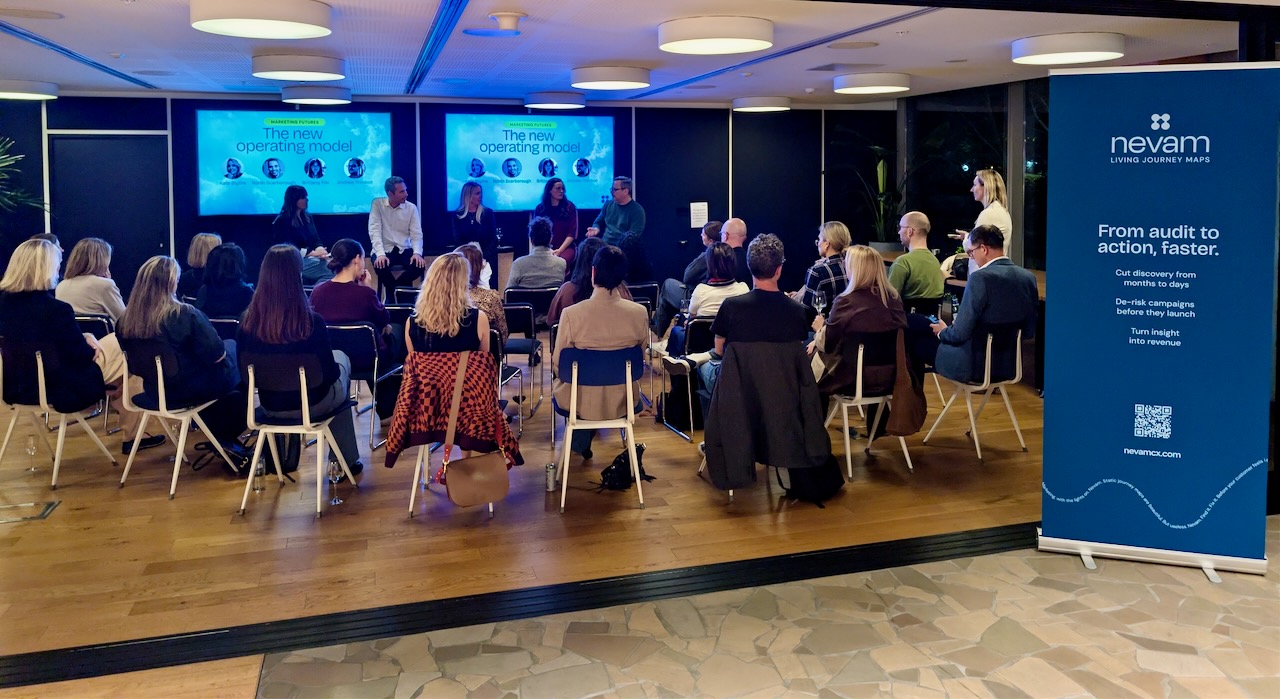
Nevam
Best for: Enterprise marketing teams accountable for a journey they can't see
Full disclosure: we make Nevam. So here's the honest version, held to the same bar as everything above. Nevam isn't the next tool on this list. It's a different category, and the list itself is the reason why. Every tool here was built to own one slice, and defends it well. None was built to give you the whole picture, because the whole picture was never any one vendor's job to hold.
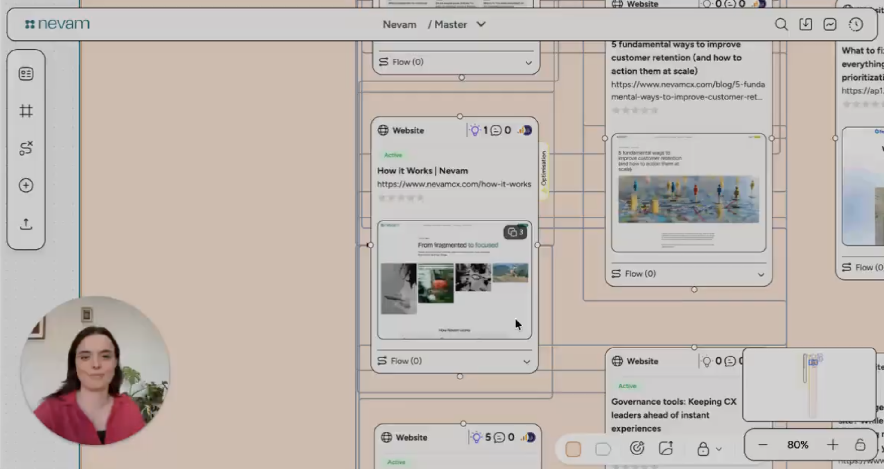
Nevam lets you see everything you have in market, across every channel, all in one place. Think of it as a way to secret-shop your own brand: the way people actually interact with you, end to end, not the version drawn in a workshop and filed away. Living journey maps are how we do it. The maps stay current, connected, and legible to everyone who has to act on them. This isn't a chart on a wall. It's where your business lives.
Discovery that took months takes days. Campaigns get de-risked before they launch, not explained after they flop. And the friction you remove shows up where it counts: waste cut, spend redirected, revenue you can trace back to the decision. Foresight, not fire drills.
Where Nevam is headed is bigger than a map. A map records what happened; we're building a digital twin of your marketing, a live model you can test against and adjust while the work is still running.
The thuth is...
No single tool here does all of this, and most of them aren't trying to. Miro and UXPressia get a team aligned on what the journey should look like. Hotjar and Fullstory show you where the digital experience snags. Amplitude is sharp inside a product. Salesforce Journey Builder fires the messages. Each one is good at its slice. Keep the ones that earn their place.
What none of them gives you is the part you answer for: the whole journey, as it really is, connected to what it costs and what it returns. That's the gap every other tool on this list quietly leaves open.
It's an expensive gap. Deciding blind means budget spent on the wrong channel, a campaign defended in a meeting nobody can settle, a quarter explained after the fact instead of shaped while it's still running. Daylight changes that. You stop hoping the work landed and start knowing, early enough to act on it.
And the bar is about to rise. Seeing the journey was the hard part for years. Soon it won't be enough on its own, because you won't be the only one acting on it. The agents arriving in every marketing stack will navigate the journey you give them, and they can only reason about an experience that's been modelled, not one scattered across twenty tools. The journey isn't the slide. It's what your customers are doing right now, and what your team, and soon your agents, will decide to do about it. The only question worth asking is whether you can see it clearly enough to move.